page content
Skip page contentOur Logo

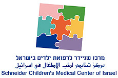
Schneider Children's logo is a puzzle, originally a children's game.
The puzzle reflects the essence of medicine: connecting the pieces to create a "whole" - body and soul.
The puzzle is positioned "askew," as children would arrange it, hinting at playful childlike innocence.
The three languages represent the hospital's vision of serving as a "bridge to peace" for all the region's children.
The seven interlocking pieces symbolize the complexity of Schneider Children's work: medical excellence, research, multidisciplinary approach, the child's world, internationalism, bridge to peace, and connection to the community.
Each puzzle piece has a unique shape and color, representing the diversity of children from across the Middle East, regardless of religion, race, or gender.
Design:
Eddy Goldfein, 1991
.jpg)


.jpg?BannerID=98)


.jpg?BannerID=97)

.jpg?BannerID=96)